
Redesigning the dashboard
As the sole product designer at an AI-driven energy management startup, I led the end-to-end redesign of the consumption dashboard, from research through a design system to engineering handoff. It shipped end of 2023 and evolved into the platform Preflet runs today.
ROLE
Lead Product designer
TIMELINE
2023-2024
TEAM
CIO · 3 engineers
Dashboard design
AI Design
User Research
B2B Saas

01 - THE CHALLENGE
Preflet: the start-up
Preflet is a SaaS startup whose AI-driven platform helps commercial and residential buildings improve energy efficiency and cut carbon emissions. When I joined, the product was engineering-led: rich in data, thin on design.
The challenge
The platform surfaced plenty of data but little understanding — of the energy itself, and of the people reading it. Preflet had no real picture of who their users were or how they used the dashboard, and engagement showed it: users logged in, looked, and left without acting. The ask was a redesign; the real problem was that nobody could say what the dashboard was for.

THE PRODUCT
What it is
The consumption dashboard for Preflet's AI-driven energy platform — where building owners read their data and decide what to do about it
THE GOAL
Why it exists
A full redesign to turn a data-rich, insight-poor dashboard into one users can find, understand, and act on.
THE USERS
Who it's for
Owners and managers of commercial and residential buildings, cutting energy costs and carbon emissions.
02 - THE RESEARCH
I set the research objectives together with the co-founder and three of his team — and used that same session to surface the assumptions they held about their users, so the research could test them rather than inherit them. Three objectives came out of it:
Understand how users actually use the platform today
Help users to make better decisions by improving the dashboard and insights section
Find what keeps users coming back — and what makes them leave
Real-time Data
Energy Efficiency Metrics
Visualizations
Comparative Analysis
Historical Data
Alerts and Notifications

Current insight page
Current insight page
The tests showed where it broke; the interviews explained why it mattered. I interviewed six building owners with experience across commercial and residential energy dashboards — evaluative research aimed squarely at the stakeholder assumptions from the kickoff. I asked things like:
Question list (keep, tightened):
"Walk me through how you monitor energy consumption today."
"What's been your experience with energy dashboards — what works, what doesn't?"
"Which metrics do you actually act on?"

Four findings, consistent across tests and interviews:
01
Users couldn't find the information they needed — the top source of frustration
02
Jargon got in the way: the language of the data blocked comprehension of the data
03
Users expected to measure their metrics against a goal they set — the platform had no concept of goals
04
Even when users understood the data, they didn't know what to do next
03 - THE PROBLEM
Problem statement
The user needs a dashboard that turns consumption data into action, because without the right information in the right language, they can't reduce their building's costs or carbon footprint — no matter how much data the platform holds.
04 - IDEATION
I set the research objectives together with the co-founder and three of his team — and used that same session to surface the assumptions they held about their users, so the research could test them rather than inherit them. Three objectives came out of it:
Help The user understand the data being showcased on the platform?

Where the ideation landed
Five directions survived, each answering a specific finding:
05 - TESTING THE CONCEPT
The concept
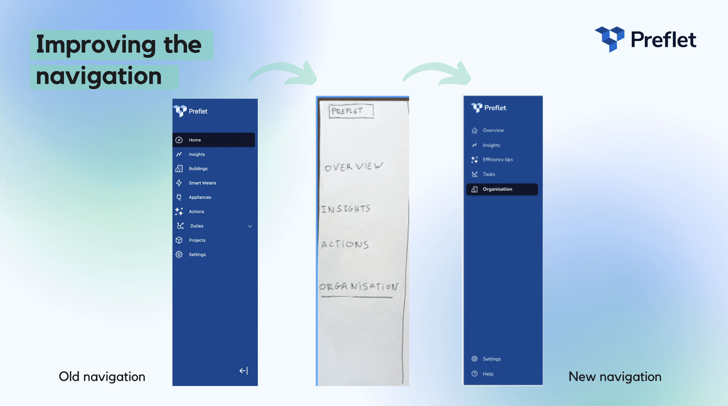


06 - THE PRODUCT
The redesign shipped in two parts: the dashboard itself — rebuilt around findability and comprehension — and a new goal-setting flow, the feature every interview asked for.
The overview, rebuilt: the three metrics users act on first, filtered by building and period — answers to the "couldn't find it" finding.
The dashboard redesign
Improved filtering: building filter and custom date ranges
New goal section, surfaced on the overview
Clear hierarchy: consumption, expenses, and carbon at a glance
02
Study detail page
Participants told us they wanted a clean feed — a study they've ruled out shouldn't keep resurfacing. So the detail page carries a decline option: not interested after seeing the full picture, one tap removes it from the feed for good.
The goal-setting flow
Users set monthly energy goals and track against them
Data shareable with other stakeholders
Metrics finally have a target — not just a trend
Goals were the expectation every interview surfaced unprompted: users wanted to measure consumption against a target they set. This flow is that finding, shipped.
07 - DESIGN SYSTEM
The redesign couldn't ship on screens alone — as the only designer, I needed the product to stay consistent without me policing every build. So I created Preflet's first design system: brand guidelines, logo usage, a defined color palette, typography, and the core components the dashboard is built from.


08 - SETBACKS & CHALLENGES
The tidy version above skips the friction. Here's what fought back — and what I took from it.
Only designer
Every decision in this case study had exactly one design voice behind it: no critique partner, no second opinion. It made me faster and more decisive — and it made the design system non-negotiable, because consistency couldn't depend on me reviewing everything.
Handoff friction
With no shared component library at the start, early handoffs leaned on annotated screens and conversation — slower and lossier than either side wanted. The design system fixed this, but it was built in reaction to the pain, not ahead of it.
Misaligned with engineering on the data hierarchy
My information architecture and the database's structure didn't match: the IA the card sort validated wasn't the shape the data actually had. We reconciled it together, but I'd involve engineering in the IA work from day one, not at handoff.
Carbon footprint never fully landed
Even after the redesign, testing showed users still struggled to grasp the carbon footprint metric. Clearer language and context helped; genuine understanding of tCO2e is a harder problem than a dashboard alone can solve. It's the part I'd keep working on.
I wanted more interviews with actual users
Recruiting Preflet's own users proved hard, so part of the research leaned on building owners from outside the platform. Right profile, but not the same as people with real usage history — with more access, current users would be the first thing I'd add.
08 - OUTCOME & MEASURES
Where it stands
The redesign shipped at the end of 2023, was showcased at Web Summit 2023, and evolved into the platform Preflet runs today. To judge it by more than looks, I defined the product KPIs with the CIO before launch — each one a research finding turned into a number to watch.

Monthly active users
are people coming back? The engagement problem that started the project.
3-month subscription retention
do they stay? The business outcome engagement is supposed to drive.
Users setting a goal
is the flagship feature landing? Goals were the research's clearest ask.
Feedback response rate
are users engaged enough to talk to us? The insight pipeline for what comes next.


