
Designing the first User Interviews mobile app
Designing the User Interviews participant mobile app — from a prompted prototype to a product on the App and Play Store, shipping alongside a company rebrand, on its way to more than seven million panelists
ROLE
Lead Product designer
TIMELINE
2026
TEAM
PM · EM · Architect · 8 engineers · DS designers · UX writer · Researcher
Mobile Design
AI Design
React Native
iOS + Android

01 - THE CHALLENGE
One app to replace them all
In January 2026, UserTesting acquired User Interviews — which, combined with the earlier UserZoom merger, left the company holding three fragmented legacy participant apps, each with real technical debt and inconsistent UX. And the panel with the most to gain had no app at all.
The challenge
Replace every legacy system with one unified app — for a product that had never shipped one — and use the clean slate to fix the web's known friction rather than port it over.


THE APP
What it is
The participant-side app for User Interviews — everything a panelist does on the web, rebuilt as a native experience.
THE GOAL
Why it exists
One unified app to replace the legacy systems, designed to fix known friction instead of carrying it over.
THE USERS
Who it's for
User Interviews participants first — then UserTesting participants and panelists, as the migration lands.
02 - THE RESEARCH
I structured the research with the PRIME framework — a format for turning raw findings into something stakeholders can decide with. Each block below is one letter of it.
P · Problem
R · Research
I · Insights
M · Material
E · Execution
Problem · What we need to answer
Before committing to a build, two questions needed answers: was an app worth building at all — and once built, did it actually work for participants?
Research · Two Phases
Framer is fully visual with no code needed, but you can still add custom code and components for more control if you're a designer or developer.
Insight · What we learned
This is a free, responsive FAQ section for Framer. Drop it into any project, customize styles and text, and use it to save time on support or info pages.
Material · The proof
Execution · What we did with it
Build the app around the notification-to-apply moment as the core loop. Fix status findability structurally, not cosmetically — it shipped as My Studies, a persistent top-level tab. The open items — status findability and error states — became the prioritized fix list for v1. The result: a validated concept, a clear value proposition, and a v1 backlog ranked by evidence.
“I would app-solutely download this and it would actually sit next to the Dscout app.”

PARTICIPANT · VALIDATION STUDY
03 - THE PRODUCT
The core surfaces of the app, from first scan to getting help. On each one, the callouts point at a decision the research earned — the details that carry the experience.

02
Study detail page
Participants told us they wanted a clean feed — a study they've ruled out shouldn't keep resurfacing. So the detail page carries a decline option: not interested after seeing the full picture, one tap removes it from the feed for good.

Tap a card and the full picture opens — everything a participant needs to decide whether this study is worth their time. This is where the application journey starts.
Where participants track every study they've applied for — the screen that answers "did I get in?"

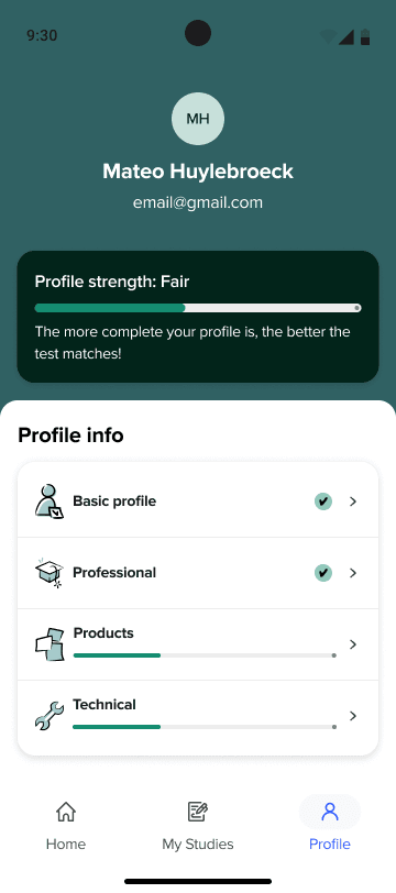
The third tab: the participant themselves — their details and everything the studies they apply for depend on.
The apply flow, end to end: browse the feed, open a study, review the details, submit an application, and track its status in My Studies
04 - DESIGN APPROACH
How the app was designed, stage by stage: from a code prototype I built for testing, to refined designs in Figma, to the live prototypes engineering builds from — and the design system work alongside.
Concept creation
Claude Code
It started as a conversation
This is where I changed how I design. Instead of starting in Figma, I prototyped in Claude Code using the PRISM framework, with the RTCCF technique structuring each prompt.
Working prototypes first, static screens second.
P · Prompting
R · Reviewing
I · Iterating
S · Specifying
M · Maintaining
The result wasn't there to be pretty — it was a working concept we put in front of people, to test whether the core flows made sense before any pixels became precious.
Iteration &
design system application
Figma
From the testing we iterated — and started crafting the designs in Figma with the new design system we created for this. Same flows, new bones.
Interaction design & devs handoff
Figma Make
In Figma Make the focus shifted to refining — working on the interactions and animations directly, and speeding the whole thing up. Doing this manually in Figma simply takes too long; here it’s live, so it flows back and forth with Figma whenever a flow needs pointing out.
Everything rolls up into the prototype control center — the project’s home base. Every flow of the app lives there as a working, tappable prototype, tagged with two statuses: where the design stands, and where the build stands.
For engineering, this became the main source of truth for progress. Instead of asking design “is this ready?”, an engineer opens the control center, sees what’s ready to build, what’s in flight, and taps through the flow itself before writing a line of code. Design status and build status, side by side, always current.

05 - BRANDING


Every other surface has to migrate to the new brand. The mobile app doesn’t — it’s the only product built in the new brand from the start, launched alongside the rebrand announcement in September 2026.
06 - ADOPTION
The other half: getting seven million panelists — who only know the web platform — to actually install it, and then migrating every panel onto one platform. Both turned out to be design problems.
PHASE 1
Pre-launch awareness
Date-agnostic teaser messaging on the panelist feed, with a notify-me opt-in.
PHASE 2
Launch-day CTA
The banner flips to “the app is here,” routing every panelist to the right store.
PHASE 3
Announcement campaign
A smart link routes each panelist to their correct store, with dual store buttons as fallback.
The design calls were mine to shape: where the CTA lives without cannibalizing attention from paid test opportunities, banner versus dismissible card versus modal, and the onboarding for someone arriving from a link. North star: panelist activation on mobile in the first days after launch.
Migration · designing from evidence
Phase 2 migrates panelists from the Classic and Unified panels onto one UI panel — a transition meant to be invisible to customers and nearly invisible to panelists. To ground it, we surveyed the panelists being migrated; I led the research direction.
07 - LEARNINGS
The workflow above looks tidy in hindsight — it wasn’t. Here’s what actually shifted, what fought back, and what I’d change.
LEARNING 01
Code-first prototypes broke my handoff model
Prototyping in code made concepting faster — but a working prototype isn’t automatically a spec. Extracting to Figma solved it; the translation step was friction I hadn’t planned for. Next time I’d define upfront what engineering actually consumes.


LEARNING 02
AI speeds up engineering more than decisions
Engineers moved faster than the design-then-build rhythm assumes, so the bottleneck risk shifted to PM and design. We had to decide at the pace of the build — or become the blocker ourselves. Staying ahead became a deliberate discipline.
LEARNING 03
Designing inside a brand still being defined
Colors, type, illustrations — all moving targets. Every decision had to hold up under a brand shifting underneath it. Some shifted with it.
LEARNING 04
Pair with engineering - and don't be afraid to code
The biggest personal shift: getting closer to the build than ever. Pairing with engineers directly, opening PRs myself when that was faster than a ticket. Handoff stopped being a wall because I stopped treating it like one.
08 - WHERE IT STANDS
Where it stands
Now Live on TestFlight. Internal beta lands September 2026, launching alongside the company rebrand.
NOW
Core MVP flows are designed and in build; Message Center, moderated scheduling, and incentive redemption are in progress.
NEXT
After internal testing: the three-phase plan goes live, bringing seven million web-only panelists onto the app.
PHASE 2
Integrating the remaining UserTesting apps and migrating every panel onto one — being designed now, grounded in the migration research.


