2025
Portfolio
E-Commerce
ROLE
Lead Product Designer
TIMELINE
2026
PLATFORM
React Native · iOS + Android
STATUS
Internal beta · Sept 2026
TEAM
PM · EM · Architect · 8 engineers · DS designers · UX writer · Researchers
Case study · 2026 · Mobile
ROLE
Lead Product Designer
TIMELINE
2026
PLATFORM
React Native · iOS + Android
STATUS
Internal beta · Sept 2026
TEAM
PM · EM · Architect · 8 engineers · DS designers · UX writer · Researchers
01 — CONTEXT
In January 2026, UserTesting acquired User Interviews. Combined with the earlier UserZoom merger, the company now owned three legacy participant mobile apps, each with significant technical debt and inconsistent UX. User Interviews itself had never built a mobile app.
Despite having no app, roughly 30% of User Interviews’ 7 million participants are mobile-only. That’s over 2 million users relying on a web experience never fully optimized for their device.
The business needed one unified app to replace all legacy systems. For design, the clean-slate build was also the opportunity to fix known friction in the web experience rather than port it over.
02 — SHAPING
The project started with shaping. I audited the existing research, then ran new studies to fill the gaps: a survey on pain points in the current web experience, and a second one measuring participant sentiment toward a User Interviews mobile app. To make the concept concrete enough to react to, we tested it with an AI-generated prototype rather than a static pitch — an early signal of how the whole project would be run.
To make the research usable across a newly merged team, I built an AI assistant on top of a consolidated knowledge base — every prior study, survey, and insight in one queryable place, so decisions could be traced back to evidence instead of opinion.
Shaping made the scope clear. This wasn’t just an app build; it was four workstreams running in parallel:
A new brand
The app would launch inside the company rebrand — designed natively in the new identity from day one.
A new design system
A React Native component library for iOS and Android, built on Mosaic, which no participant-facing surface had used before.
A migration plan
Moving UserZoom and UserTesting participants onto the User Interviews platform, consolidating every panel into one.
A focused MVP
Working with the PM to define the v1 scope and roadmap — deciding what not to build was the main job.
03 — EVIDENCE
I structured the research work using the PRIME framework — Problem, Research, Insights, Material, Execution. It’s a format for turning raw research into something stakeholders can actually make decisions with: the problem sets context, the research shows the methods so findings feel credible, insights are the three-to-five things learned, material is the proof, and execution is a suggested direction — enough for the team to decide what’s next. Below, both research phases mapped to it.
P
Problem
User Interviews had never built a mobile app, and the merged company inherited three fragmented legacy apps. Before committing, we needed to answer two questions: was an app worth building at all — and once built, did it actually work for participants?
R
Research
Two phases. Phase 1 — Foundational: we consolidated all existing research into a knowledge base, ran two surveys (web experience pain points; app sentiment), and synthesized 19,375 open-text responses across three participant lifecycle cohorts. Phase 2 — Validation: we created an AI prototype based on the foundational insights, then tested it on our own platform — an unmoderated think-aloud study on UserTesting, 10 participants, four research areas: browse & apply, status tracking, post-acceptance, and app vs. mobile browser.
I
Insights
1. 30% of participants are mobile-only users — a third of the panel underserved by a desktop-first experience.
2. The web experience had real friction: time-sensitive studies lost to the desktop gap, no visibility into application status, and trust-breaking failures after completing studies (wrongly marked no-shows, missing payments, silent support).
3. The prototype validated the core value proposition: 9 of 10 participants would open the app after a study email — the notification-driven use case works.
4. Status findability is an IA problem: participants understood their application status once they found it, but couldn’t find it easily.
M
Material
4.8 / 5
Likelihood to download the app
9 / 10
Participants would open the app after a study email
19,375
Open-text responses synthesized in foundational research
“Within 10 minutes of getting the email about it, it was already full and I couldn’t get in.”
Participant — foundational survey
“I would app-solutely download this and it would actually sit next to the Dscout app.”
Participant — prototype study
“Overall great design, especially bringing in visuals that give quick context to a study. Easy to navigate and find what I am looking for over multiple categories.”
Participant — prototype study
E
Execution
Build the app around the notification-to-apply moment as the core loop. Fix status findability with a persistent status entry point on the home screen in a future iteration. The open items — status findability, error states — became the prioritized fix list for v1.
The result: a validated concept, a clear value proposition, and a prioritized fix list for v1.
PLACEHOLDER — IMAGE
AI-generated prototype used in the validation study — 2–3 key screens, or a short screen recording of the think-aloud setup
04 — FOUNDATION
Design had a seat at the architecture table. The team evaluated five stacks — native iOS + Android, Kotlin Multiplatform, React Native, Flutter, .NET MAUI — against the capabilities the product depends on: screen recording, camera + audio, background uploads, on-device ML.
Instead of deciding from slides, we built: eight working proof-of-concept apps (four iOS, four Android) in under two weeks, generated in parallel with AI-assisted, spec-driven development.
React Native won on a clear principle: cross-platform where it accelerates, native where it must be. One codebase for screens, navigation, and state; native modules where platform APIs demand it. The JS/TypeScript ecosystem was also a deliberate pick — it’s where AI tooling works best, and that’s how we planned to work.
One design call I pushed for early: no lowest-common-denominator UI. Liquid Glass on iOS, Material on Android — one brand, two platform-native expressions.
PLACEHOLDER — iOS
Same screen, Liquid Glass expression
PLACEHOLDER — Android
Same screen, Material expression
PLACEHOLDER — POC
One of the eight AI-generated proof-of-concept apps
05 — CRAFT
Scope came first. I worked with the PM to prioritize the MVP and align on the API — what the app needed at launch, not what it could eventually become. That gave us eight flows for Phase 1:
Sign in + sign up
Application flow — Test Feed core screens, study detail page, screeners + outcome pages
Profile page + account, and profile editing
Message Center
My Studies
Moderated test scheduling
Incentive redemption
Then I changed how I design. Instead of starting in Figma, I prototyped in Claude Code using the PRISM framework — Prompting, Reviewing, Iterating, Specifying, Maintaining — with the RTCCF prompting technique for structuring each prompt. Working prototypes first, static screens second.
Once a prototype held up, I extracted it to Figma and built the full flows there — the artifact engineering needed for handoff. Collaboration didn’t stop at handoff either: I stayed close to the build, and wasn’t afraid to code myself and open PRs when it was faster than writing a ticket.
PLACEHOLDER — PIPELINE VISUAL
The prototype-to-production pipeline: Claude Code prototype → Figma full flows → React Native build. Side-by-side of the same flow at each stage.
PLACEHOLDER — Test Feed
Core screens, final UI
PLACEHOLDER — Study detail
Reward + duration elevated per research
PLACEHOLDER — Screeners
Screener + outcome pages
PLACEHOLDER — My Studies
Status tracking
PLACEHOLDER — INTERACTIVE PROTOTYPE
Embed the interactive prototype here (Figma embed or hosted build) — let the reader tap through the apply flow themselves
06 — IDENTITY
The app was designed mid-rebrand. The new identity was being defined in parallel: Public Sans typography, a new color system, and a new illustration set. Every other surface has to migrate. The mobile app doesn’t — it’s the only product built in the new brand from the start, shipping alongside the rebrand announcement in September. My role: I sat between the branding team and the design system team, translating the new identity into product reality. I drove the consolidation of two component libraries into one in the unified design system. The impact: decisions made for the mobile app became the company standard. The app set the design system direction — web now adopts the new unified design system to reach parity with mobile, not the other way around.
PLACEHOLDER — BRAND IN PRODUCT
New identity applied in the app: typography, color system, and illustration set — before/after against the legacy web experience
07 — LAUNCH
Building the app is half the job; the other half is getting 7 million existing panelists — who only know the web platform — to actually install it.
I co-drafted a three-phase adoption strategy with the PM, aligning Mobile, Web, and Marketing behind one plan:
P1
Pre-launch awareness
Date-agnostic teaser messaging on the panelist test feed, running through September, with a possible “notify me” opt-in to build a warm, consented launch-day audience.
P2
Launch-day in-product CTA
The banner flips to “the app is here,” linking panelists to the right app store.
P3
Launch announcement email
Smart link routing each panelist to their correct store, with dual store buttons as fallback.
The design questions were mine to shape: where the CTA lives without cannibalizing attention from paid test opportunities, banner vs. dismissible card vs. modal, and the onboarding experience for someone arriving from a link. The north star metric: panelist activation on mobile within the first days after launch.
08 — WHAT’S NEXT
In progress
The app is Phase 1 — the User Interviews web experience, native on mobile. Phase 2 is bigger: integrating the other UserTesting apps into the UI mobile app and migrating panelists from the Classic UT and Unified panels onto one UI panel. The goal: a migration invisible to customers and mostly invisible to panelists. This work is currently being designed.
To ground it in evidence, we surveyed the panelists being migrated: 1,015 responses across 8 markets, completed in 7 hours. The headline: 73% are committed to staying, only 1.4% at risk of leaving. But the concerns are specific — payment continuity is the top fear in 6 of 8 markets, and the mobile-only third of the panel is the fragile third. For them, a desktop-dependent migration step isn’t friction, it’s a wall.
1,015
Survey responses across 8 markets — completed in 7 hours
73%
Committed to staying through the migration
6 / 8
Markets where payment continuity is the top fear
Design input: the research translates directly into design constraints we’re working from — every migration step (verification, profile, payment setup) must work end-to-end in the app; total transition effort stays under ~10 minutes, sequenced and bundled rather than stacked on one visit; and the app has to deliver a visible mobile win at migration, because this is the surface the mobile-only third will judge the whole transition by.
09 — TODAY
TestFlight live
The app enters internal beta in September 2026, launching alongside the company rebrand — live on TestFlight on iPhone and iPad today. Core MVP flows are designed and in build; Message Center, moderated scheduling, and incentive redemption are in progress.
Next: first customers after internal testing, the three-phase adoption push to 7 million panelists, and Phase 2 — integrating the remaining UserTesting apps and migrating all panels onto one platform. That work is being designed now, grounded in the migration research above.
PLACEHOLDER — TestFlight
App running on iPhone
PLACEHOLDER — iPad
iPad layout
10 — TEAM
PM
We prioritized the MVP together and aligned on the API; scope decisions were joint, not handed down.
Design system designers
We consolidated two component libraries into one on Mosaic, with the app setting the direction for the company.
UX writer
Supported the flows with copy review and refinement; I drafted in-product copy as part of the design work.
Researchers
Supported with foundational synthesis, prototype validation, and the migration survey; I led the research direction.
EM and architect
I was in the room for the platform decision, contributing design criteria to the stack evaluation and the eight POCs.
iOS & Android engineers
Handoff wasn’t a wall. I extracted prototypes to Figma for full flows, stayed close to the build, and opened PRs myself when that was faster than a ticket.
11 — REFLECTION
→ Code-first prototypes broke my handoff model
Prototyping in Claude Code made concepting faster, but handoff got harder — a working prototype isn’t automatically a spec. Extracting to Figma for full flows solved it, but the translation step was friction I hadn’t planned for. Next time I’d define upfront what engineering actually consumes: the prototype, the Figma file, or both.
→ AI speeds up engineering more than it speeds up decisions
Engineers moved faster than the traditional design-then-build rhythm assumes. The bottleneck risk shifted to PM and design — we had to make decisions at the pace of the build, or become the blocker ourselves. Staying ahead of engineering became a deliberate discipline, not a given.
→ Prototypes in code should be easier to test
We validated with an AI-generated prototype, and it worked — but getting code prototypes into a testable state took more effort than it should. There’s an unsolved gap between “runs on my machine” and “ten participants can use it in an unmoderated study.”
→ Designing inside a brand still being defined
The visual identity was landing while the app was being designed — colors, type, and illustrations all moving targets. It forced flexibility: design decisions had to hold up under a brand that could shift underneath them, and some did shift.
→ Pair with engineering, and don’t be afraid to code
The biggest personal shift: getting closer to the build than I’ve ever been. Pairing with engineers directly, and coding myself when it was the fastest path — fixing details and finishing work in the codebase rather than annotating screenshots. Handoff stopped being a wall because I stopped treating it like one.
Case study · User Interviews mobile app
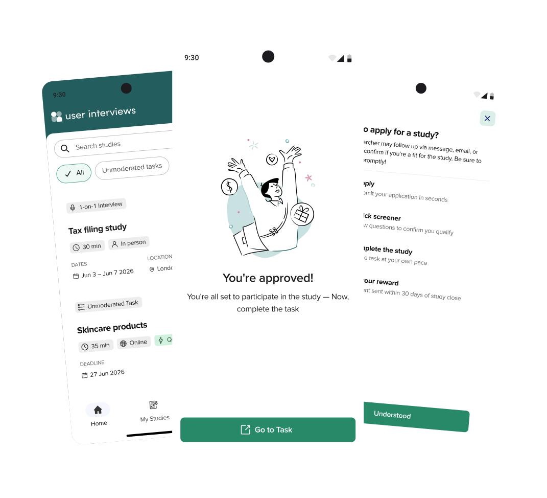
user interviews
9:30
Search studies
1-on-1 interview
Tax filing study
30 min · In person · $65
Unmoderated task
Skincare products
35 min · Online · $40
01 · HOME
Make the reward impossible to miss
Research showed the payout is the biggest driver when participants scan studies. It became the highest-contrast element on every card, visible before the title itself.
DESIGN DECISION
One-second scanning beats a dense feed.
Home
The first thing a participant sees — built around what the research said matters most. We researched which information matters most to participants when scanning studies. The answer was unambiguous: the reward is the biggest driver — so the payout is the single highest-contrast element on every card, read before the title itself. Everything else a participant weighs — study type, duration, format, dates, location — is chipped, so a card can be judged in about a second and the feed skimmed without opening anything.
Study detail
Tap a card and the full picture opens — everything a participant needs to decide whether this study is worth their time. This is where the application journey starts. Participants told us they wanted a clean feed — a study they’ve ruled out shouldn’t keep resurfacing. So the detail page carries a decline option: not interested after seeing the full picture, one tap removes it from the feed for good. Decide either way from one place: the same screen that lets a participant walk away is the starting point of the application flow — so applying is an informed choice, not a gamble on a card summary.
My Studies
Where participants track every study they’ve applied for — the screen that answers “did I get in?” This closes the loop on the validation study’s sharpest finding: participants understood their application status once they found it — they just couldn’t find it. The fix was structural, not cosmetic: status became My Studies, a persistent top-level tab, one tap from anywhere in the app.
Profile
The third tab: the participant themselves — their details and everything the studies they apply for depend on. This screen is designed ahead of its biggest test. Phase 2 migrates UserTesting participants, who carry far richer demographic profiles — so the page is structured to scale, with new categories slotting in without a redesign. When the migration lands, it lands on a surface that’s already shaped for it.
Message center
A direct line between participant and researcher, inside the app. The foundational research named “silent support” among the trust-breaking failures of the web experience — completing a study and hearing nothing back. The message center is the structural answer: participants can reach the researcher directly, so a question or a problem has somewhere to go.
Scroll sideways · one step per screen